STATE FAIR
Packaging Design
Art Direction: Paul Sheriff
Made For: Tyler School of Art and Architecture
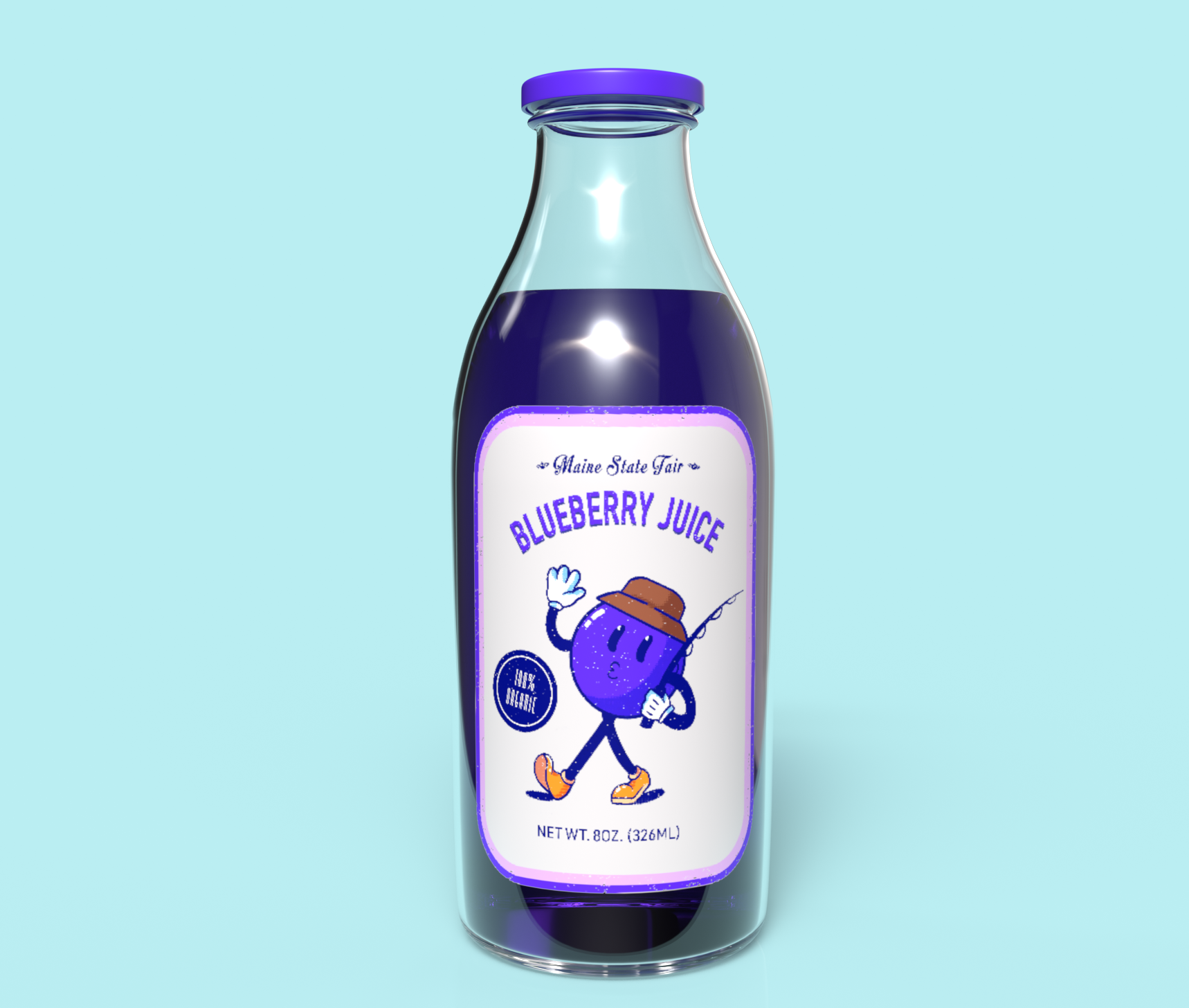
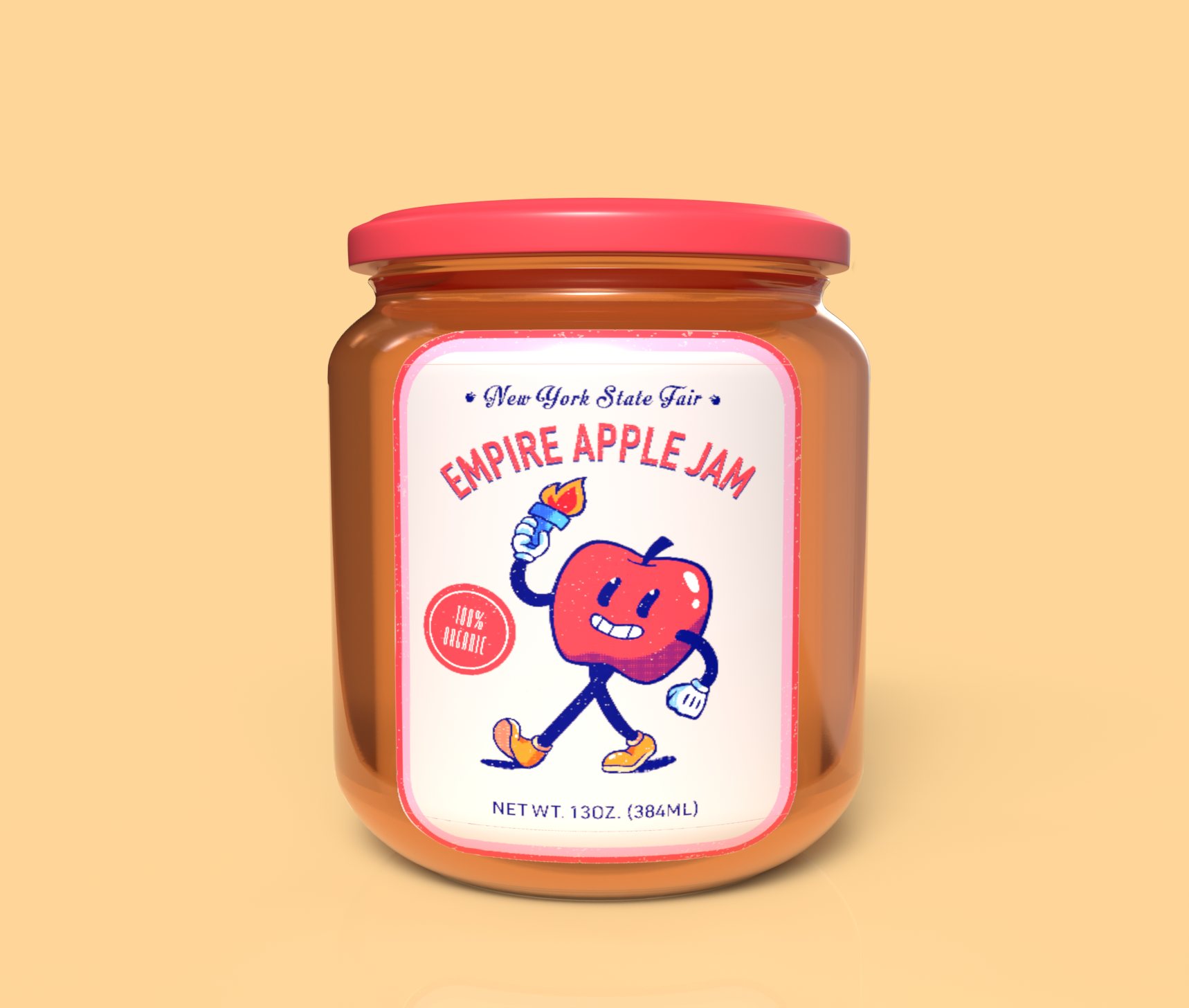
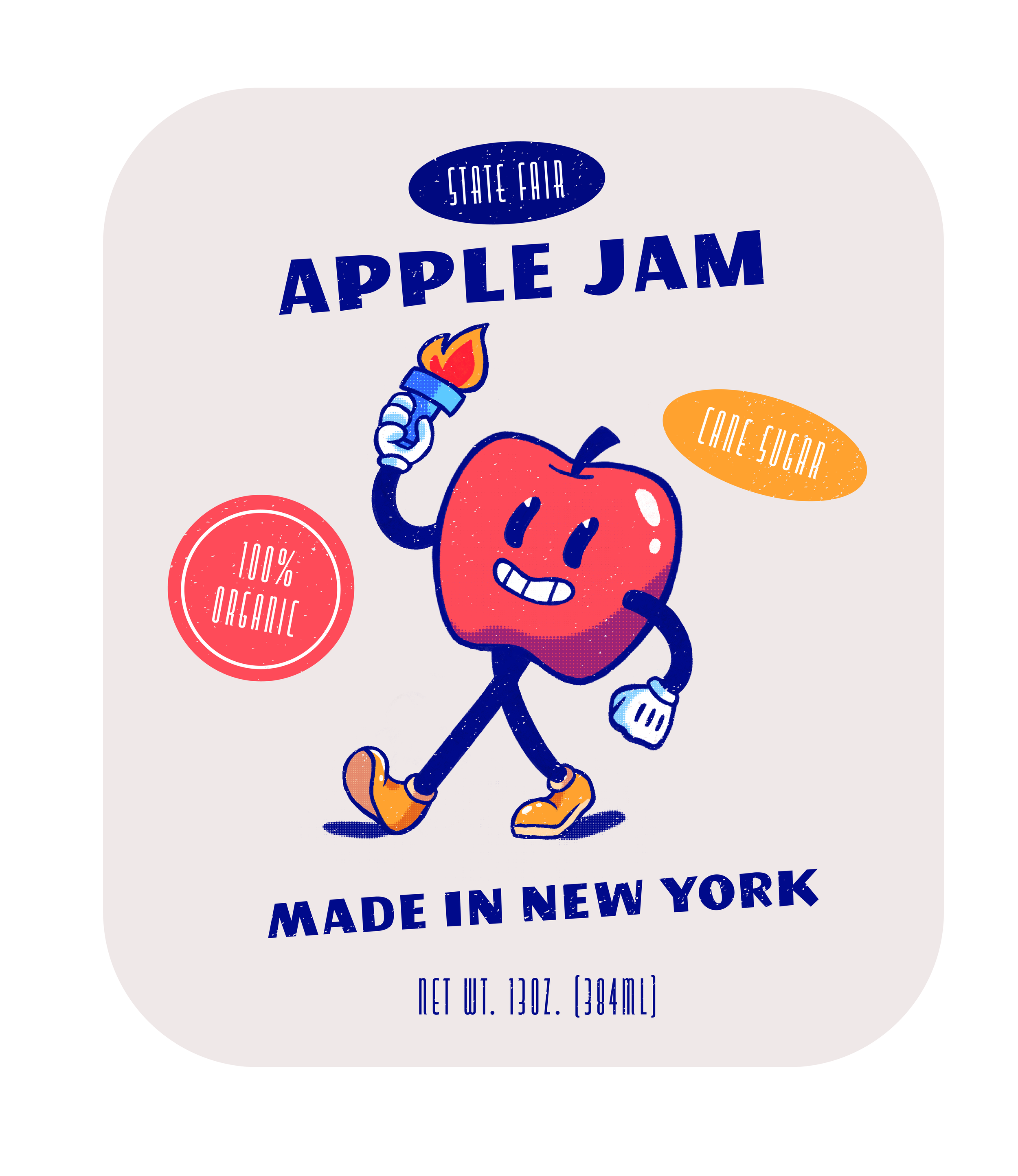
State Fair is a packaging project that covers iconography across the U.S. while keeping consistent branding through bright and colorful characters.
Character Design
Instead of drawing the produce realistically, I wanted to do something more lighthearted and fun. Inspired by rubber hose animation, I designed characters for each individual state and gave them features that are associated with them. Maine is known for its bass fishing, the torch is associated with New York’s Statue of Liberty, and Florida is known for its orange juice.
Previous Designs
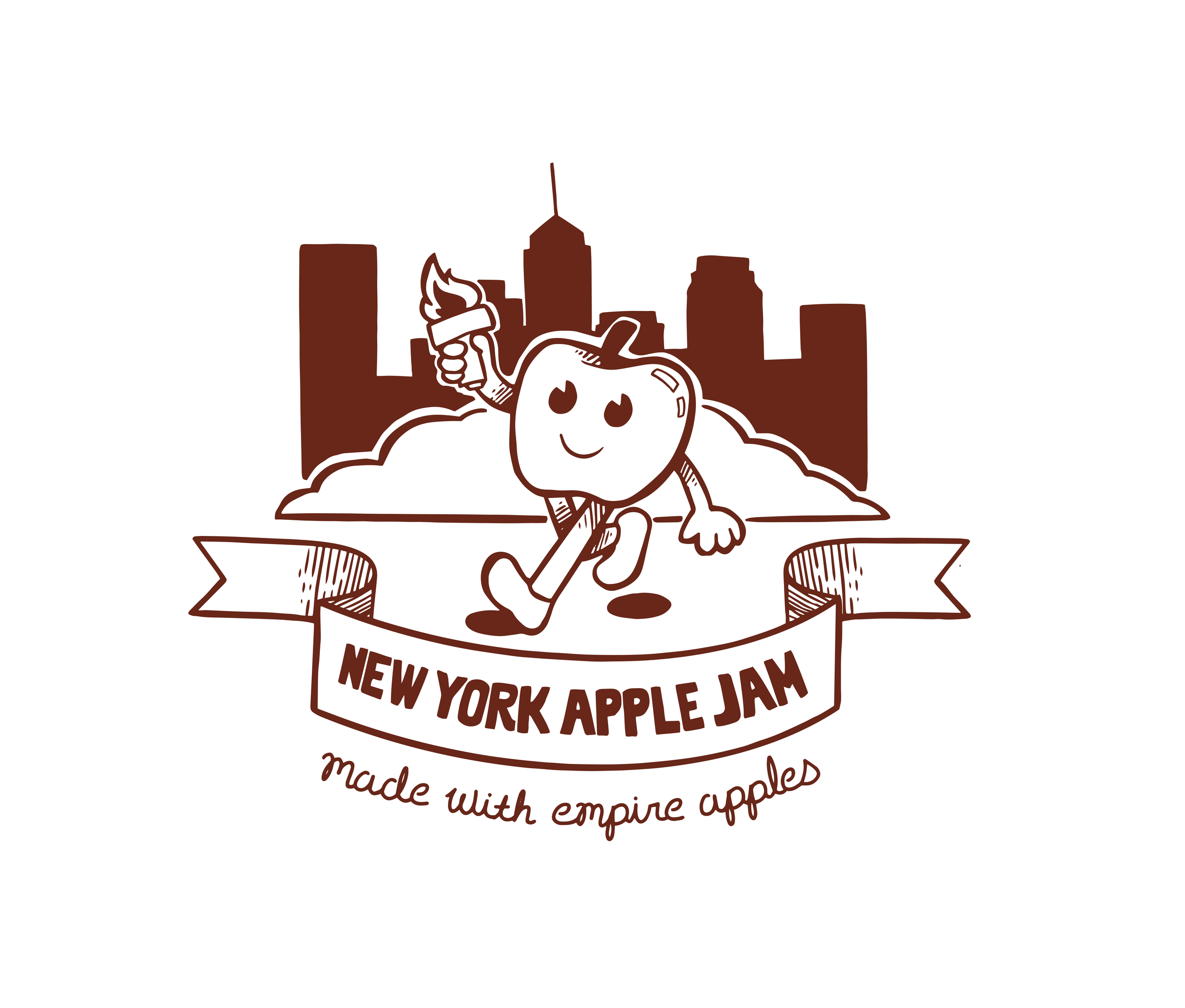
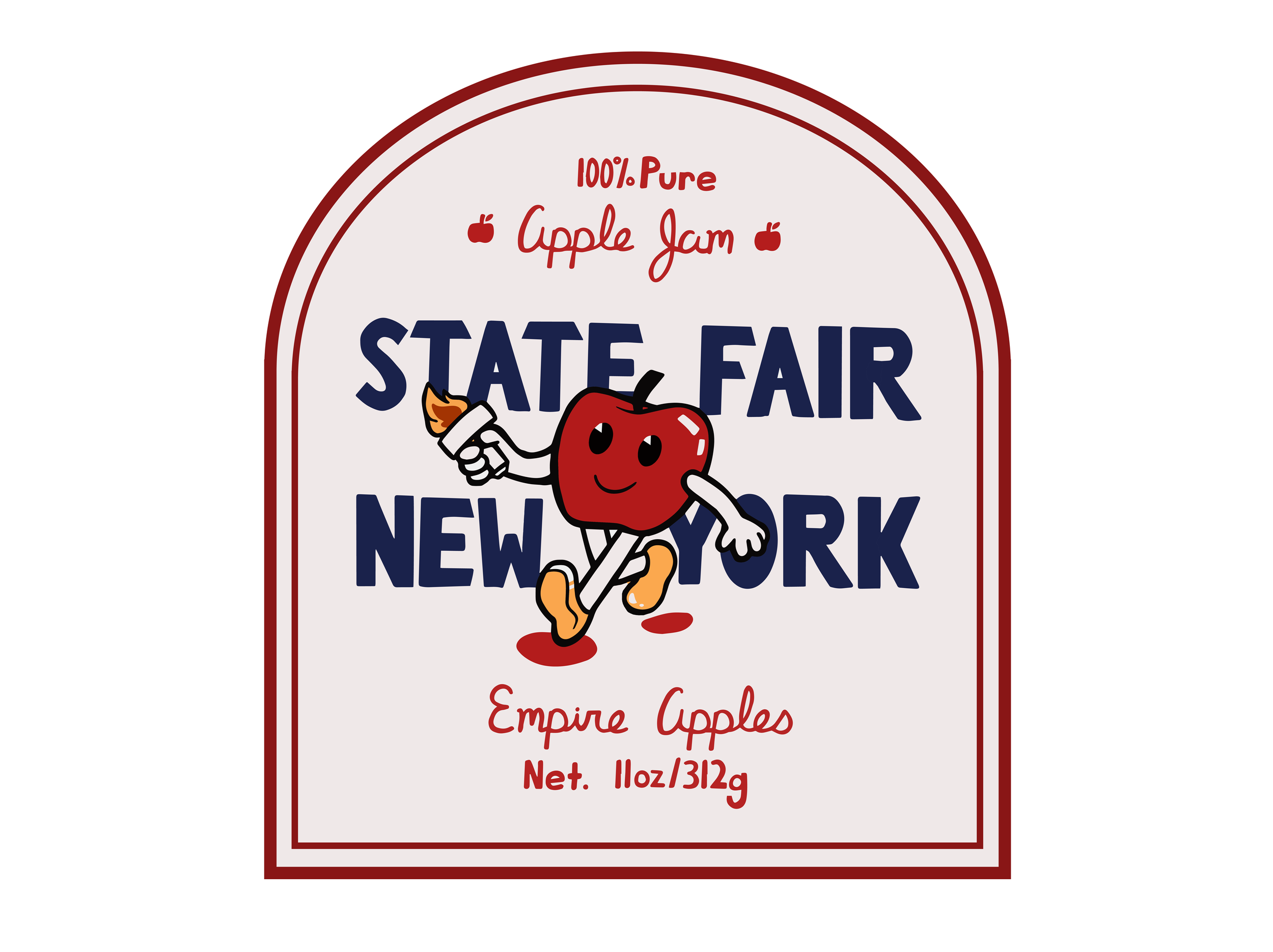
In the beginning stages of designing this packaging, the biggest concern was getting the style down. My first few attempts were able to get the general composition but still lacked the fluidity of rubber hose. The characters were also too small when they should’ve been the main focus of the packaging. After I got the character design and my composition set up, minor adjustments such as adding fewer stickers and a border were needed to clean the design up further. Eventually, I managed to make these corrections and ended up with an endearing design.


