
THORNDALE THUMPERS
Branding
Art Direction: Caleb Heisey
Made For: Tyler School of Art and Architecture
A conceptualized minor league softball team that’s all-inclusive and brings in elements of the neighborhood it represents.
Background
When preparing to design for a softball team, I was randomly provided with a fictional team that comes from a neighborhood in Pennsylvania with an adjective that matches it. Since I had never been to Thorndale, I began to research the area to see if there were some elements I could borrow. I noticed that Thorndale has a regional rail station that has hundreds of boardings weekly and a lot more greenery compared to Philadelphia. With this information provided, I began to start with the monogram.
Monogram
Given that Thorndale has a regional rail station, I wanted to focus on the steel aspect of the train. Since the adjective was “thump,” it was perfect to use a hammer for the monogram. To add more motion to the monogram, I bent the form and added a stroke that represents swinging.
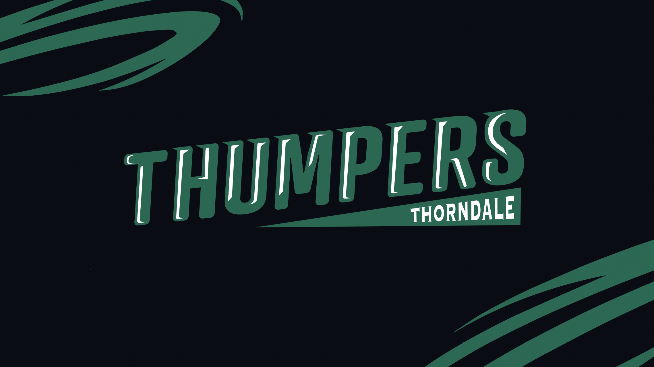
Brand Board
Regarding colors, it was important to have colors that have high contrast due to the players being far away from the viewer. It allows the team name and player number to stand out on the field. For the overall lockup of the team logo, I used Atrament Bold and added sharp serifs along with highlights to make the typeface more dynamic than it was before.

